This was an interesting challenge to design for. I imagined myself lying in a garden meadow looking up to the stars! With all the light pollution we have in the Chicago area it never really gets very dark!
Midnight Meadow Tapestry
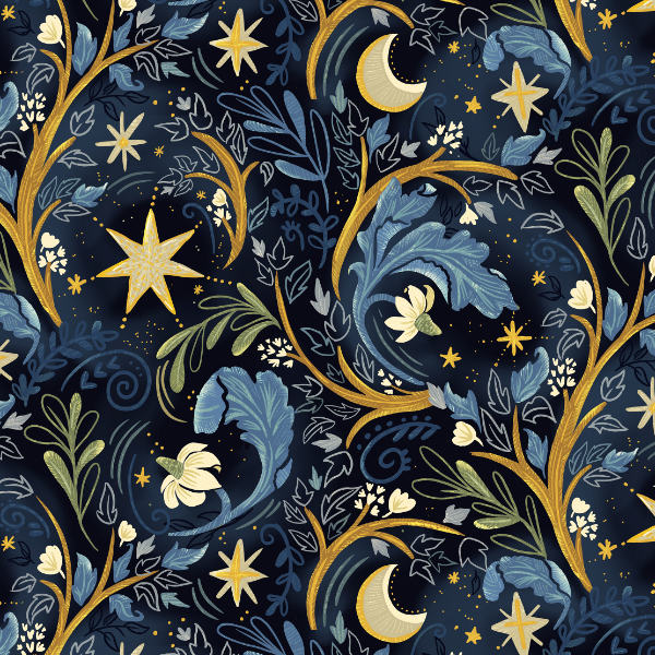
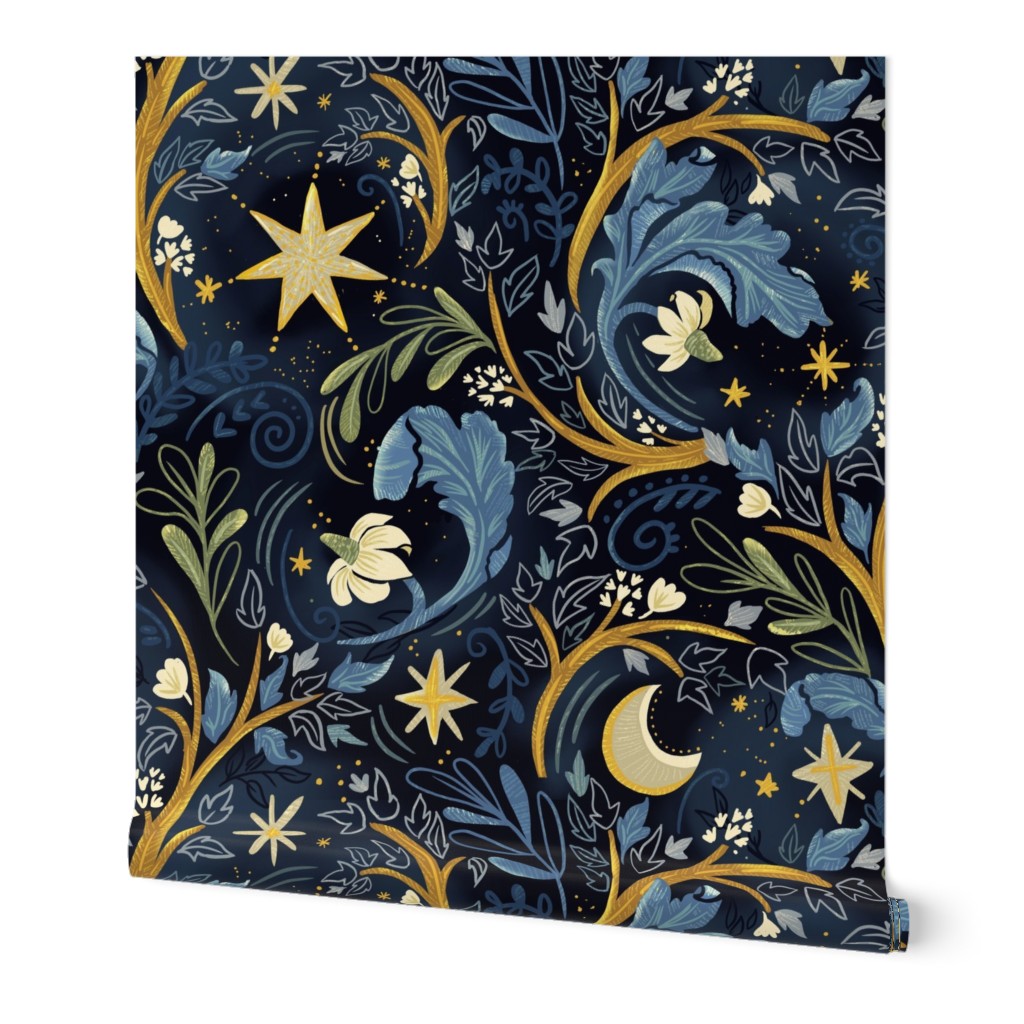
This was an interesting challenge to design for. I imagined myself lying in a garden meadow looking up to the stars! With all the light pollution we have in the Chicago area it never really gets very dark!


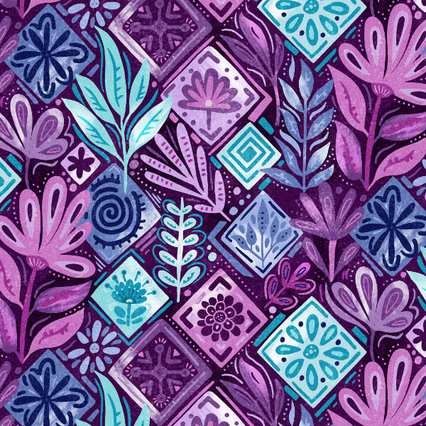
The palette of Jewel Tones is really up for interpretation so I think this challenge will be all over the place! I went for a patchwork sort of look which would really stunning made into overalls, or dungarees as us Brits call them!
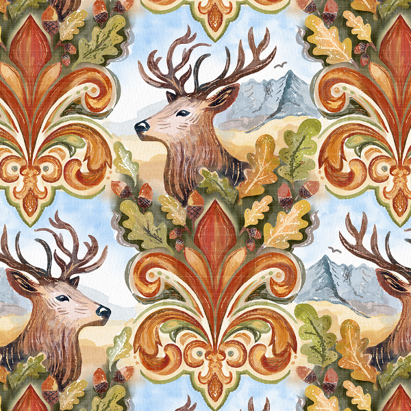
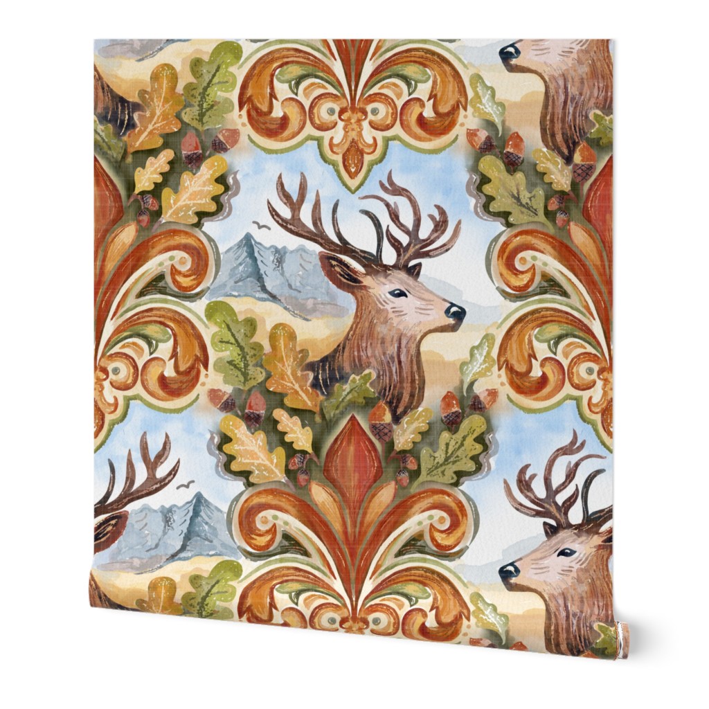
The spoonflower challenge this week is to create a design that channels the vintage Americana-meets-British aristocracy look found in classic country clubs. Having split my life almost 50-50 between the USA and Britain, this prompt spoke to me but have to say the “sport” of hunting is very different either side of the pond.
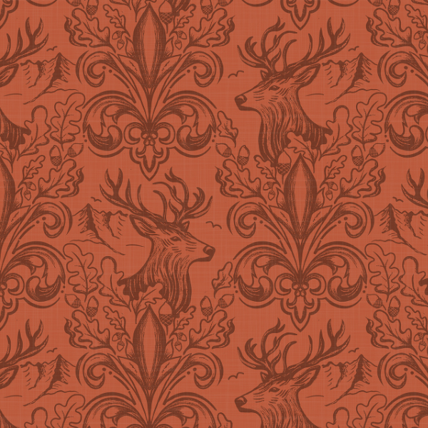
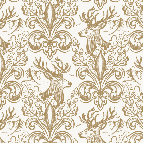
I also did some line art versions.

I already have a whole collection of Animal Print Patterns on Spoonflower but it is the prompt for this week’s challenge so I conjured up something different.
If 70′ decor is making a come back then I cringe, but it is the prompt for this week’s Spoonflower challenge.
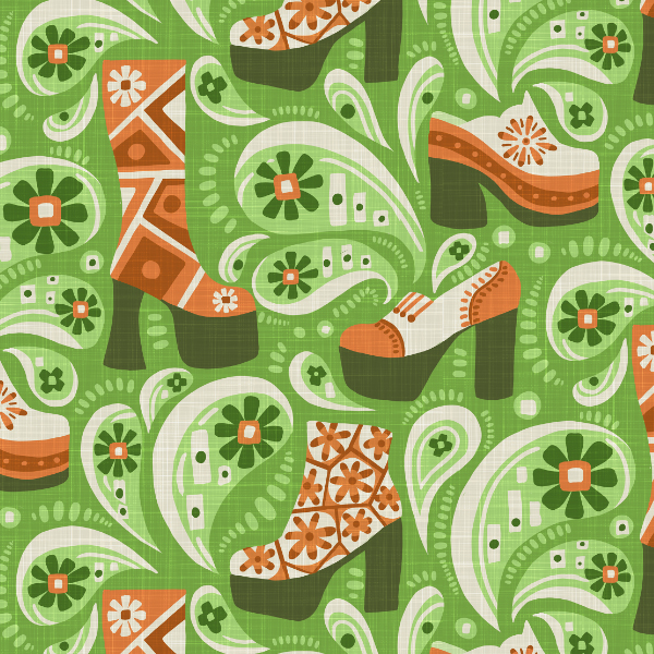
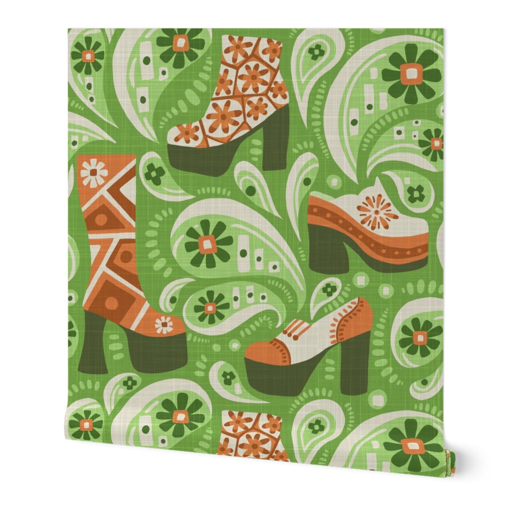
I fiddled about with loud geometric shapes but nothing really spoke to me so I went in a completely different direction and ended up channeling platform boots … as you do! It would make a really interesting wallpaper for a vintage clothing store.
70s Platform Shoes And Paisley
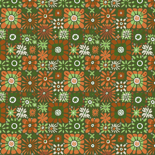
I also updated a old design I had done for a previous 70’s challenge to reflect the colorways of my new design
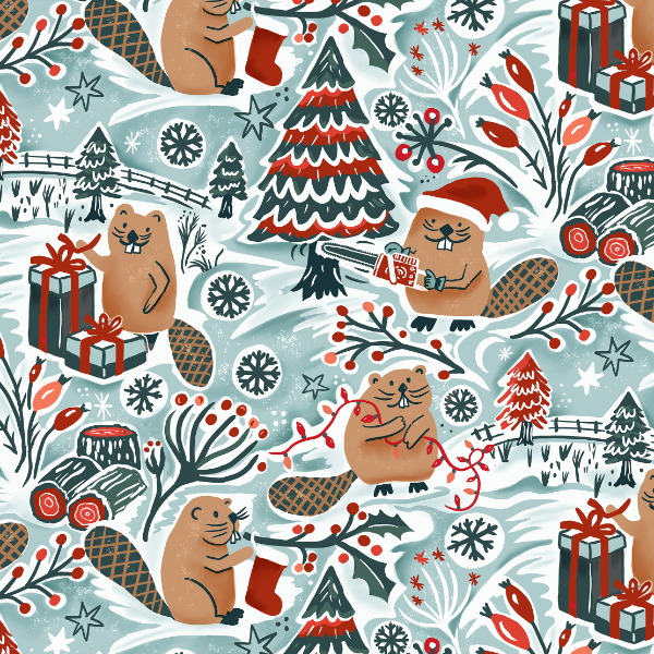
This week’s Spoonflower challenge is Festive animals and over the years I have created quite a few designs that fit neatly into this prompt. See my Christmas Festive Animals collection
I thought I’d be stumped for ideas for this one but I have been playing around with my Busy Dam Beavers and thought it was about time they had some Christmas fun. Beavers aren’t really an animal you associate with Christmas but that is how I like to roll!
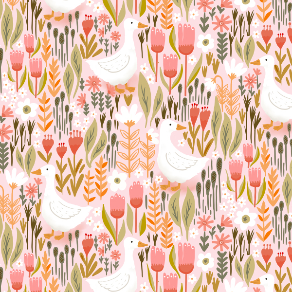
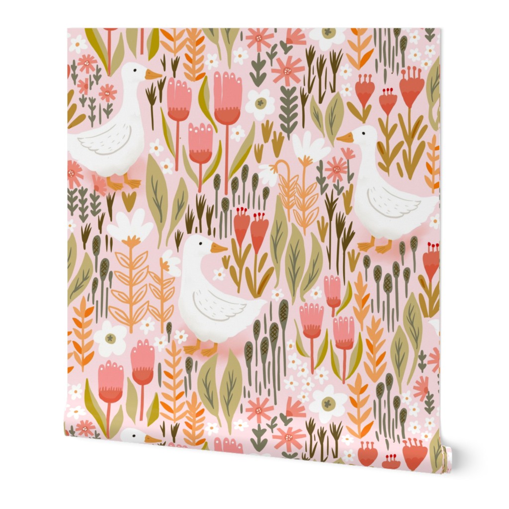
Cottagecore is the prompt for this week’s Spoonflower challenge and it was a fun one to design for. I went for a soft color palette and transported myself to a floral meadow with free range ducks.
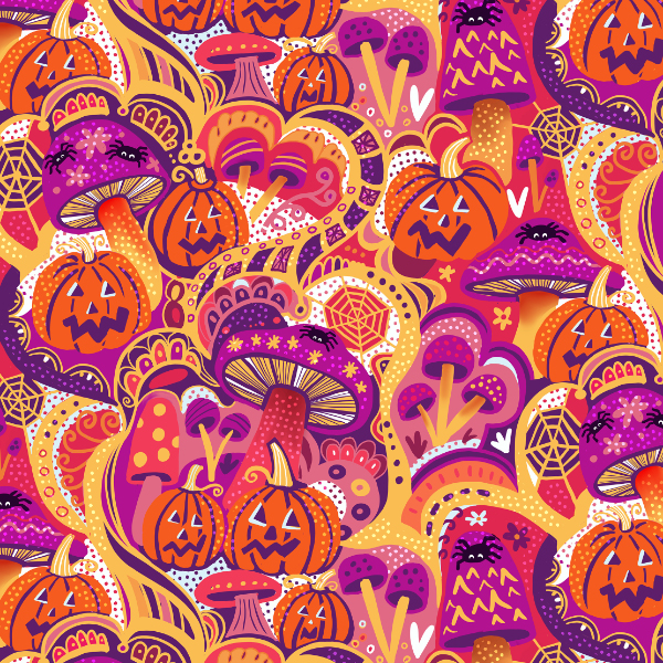
I have barely broken out my summer clothes but am already channeling fall, with thoughts of Halloween and ideas for the retro Halloween Spoonflower challenge.
I have gone super funky hippy psychedelic with a pumpkin and mushroom design. It is a bit wild!
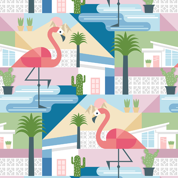
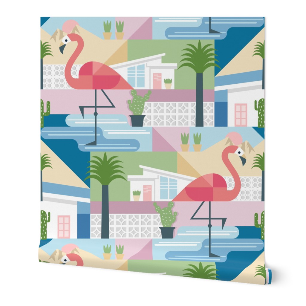
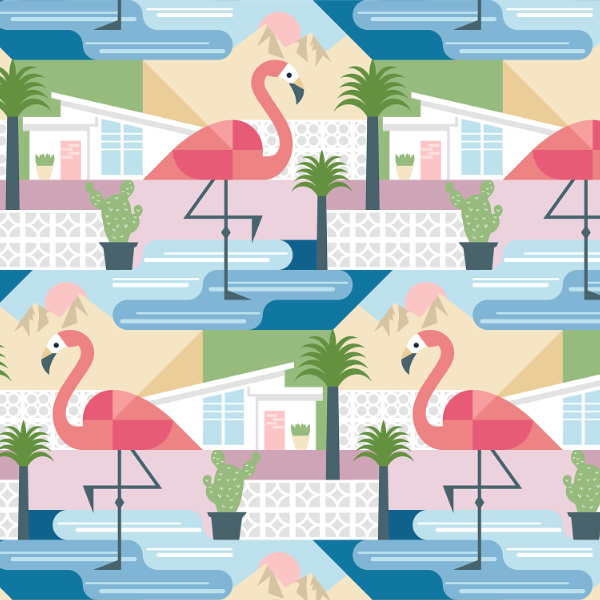
Once again the prompt for this week’s Spoonflower challenge is a bit of a puzzle. Palms Springs. They had an identical prompt a few years back and I have to say, if it is a trend that is blowing up all over the place, it is not something I have noticed. So to run it again is odd and when you have designed for a prompt once (and successfully landed in the top 10 – 6th place), it is even harder to design for it again.
Phew got that off my chest.
I decided to riff off my design that place well last time, using some of the same design elements and an identical color palette but I introduced some fun flamingos and well thought out angles. It ended up looking very different
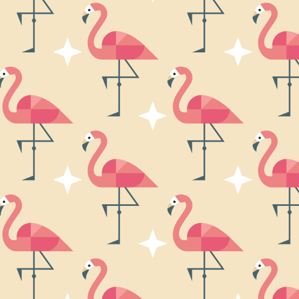
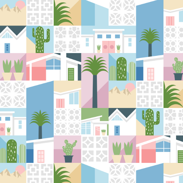
In typical fashion I created a few coordinate designs too!



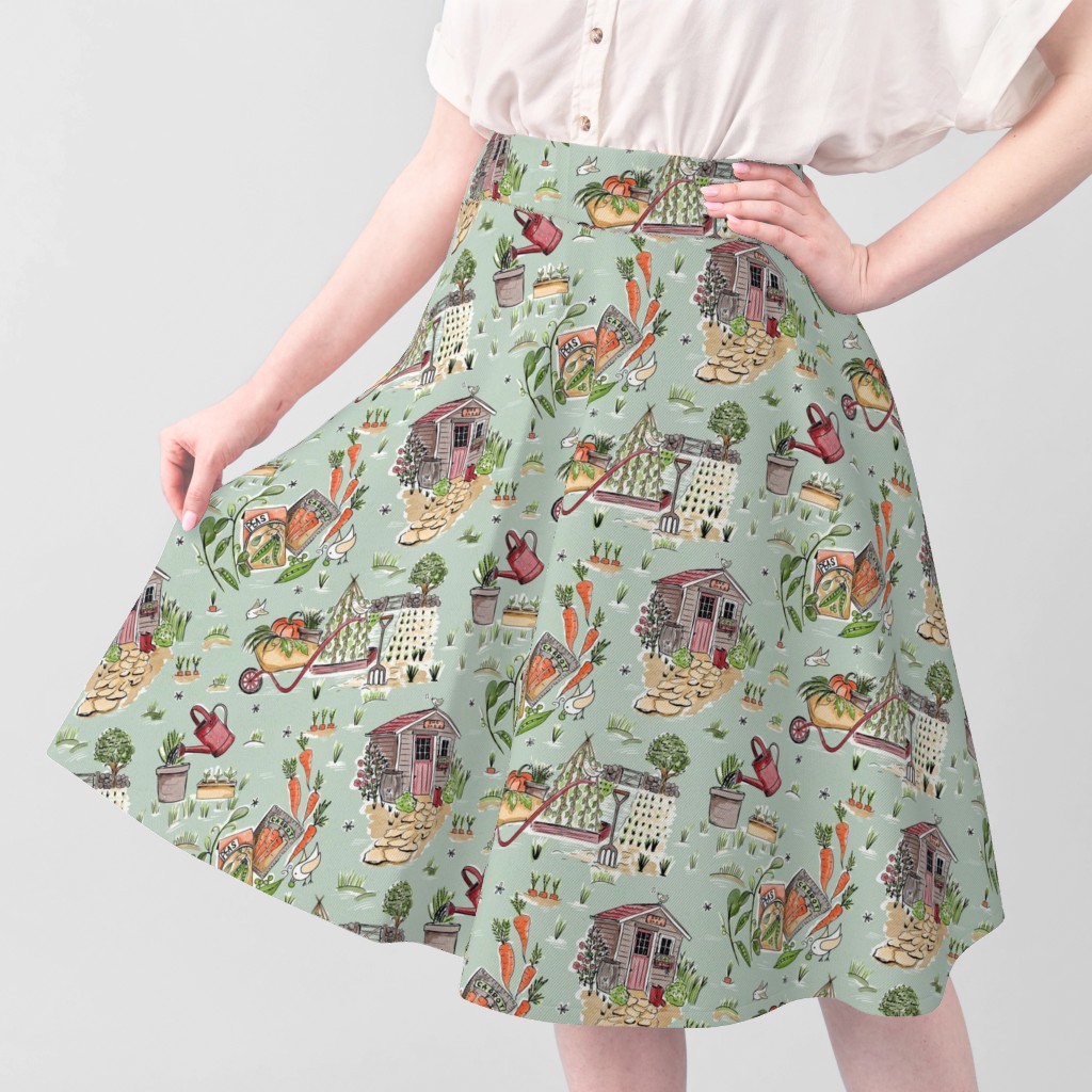
I have rented a garden plot this year and as I have never grown a vegetable in my life, my goal is to produce one edible piece of produce, the bar is low hahah! I have spent so much time planning, digging and sowing seeds that it was my obvious inspiration for the Spoonflower Toile with a Twist challenge this week .
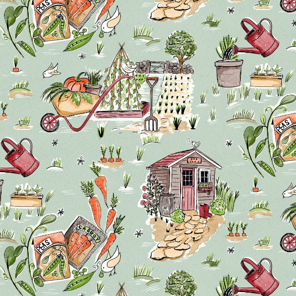
My plot does not have a She Shed but I have planted peas carrots and beans!
