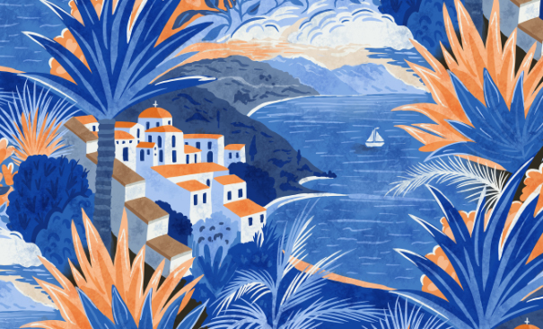
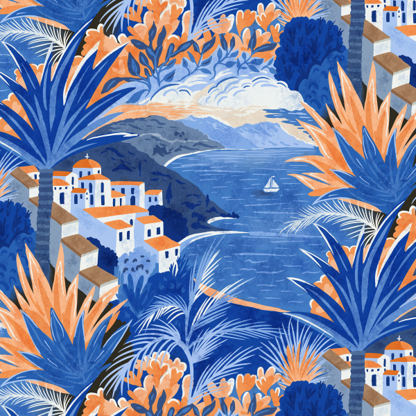
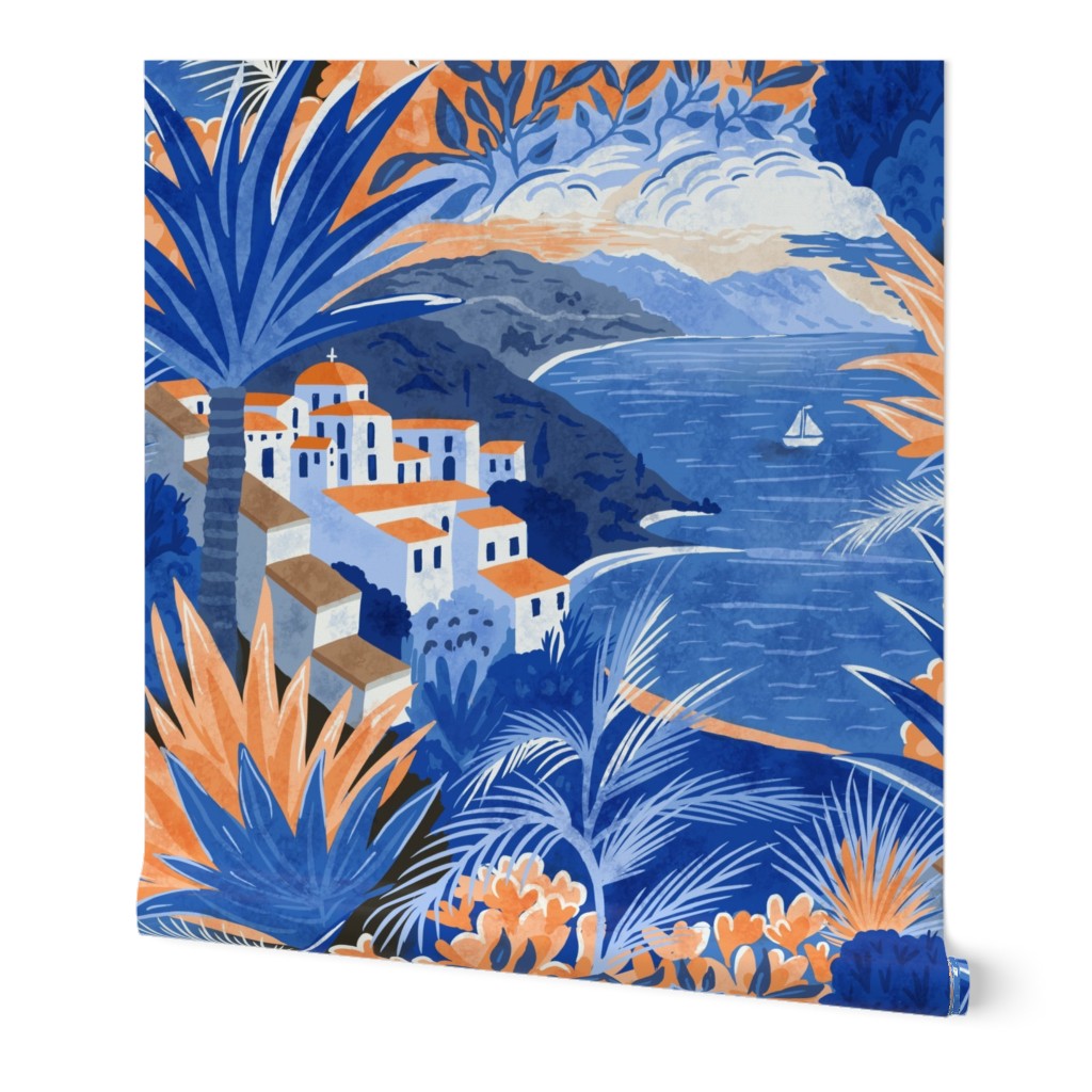
This was such a fun challenge to design for and I couldn’t get my idea out of my head fast enough. So much so, I created almost all this design while whizzing around the UK by train a few weeks back. The bumpiness of the ride made it quite difficult
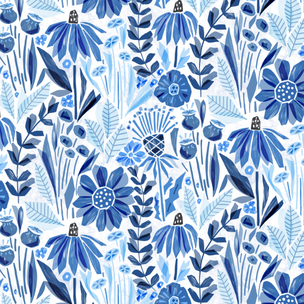
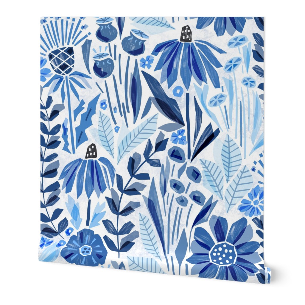
It seems Spoonflower wants some more floral designs so this week is yet another floral based challenge ” Wild Flower Collage” Be prepared for 20+ pages of designs to wade through.
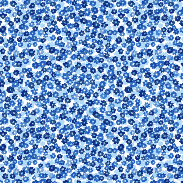
My design was inspired by papercut flowers and I went for a simple ( but firm favorite) palette of blue and white.
It seems that the prompts for the spoonflower challenges are being written by AI, the images that accompany the prompts are certainly AI and they have been called on that. This is the challenge description
Retro Nouveau
“This mashup mixes the organic motifs and ornate shapes of Art Deco with the bold colors and geometric patterns of a retro vibe.”
Art deco and Art Nouveau are not even that same styles, so the whole thing is very confusing.
Even more confusing is what to design.
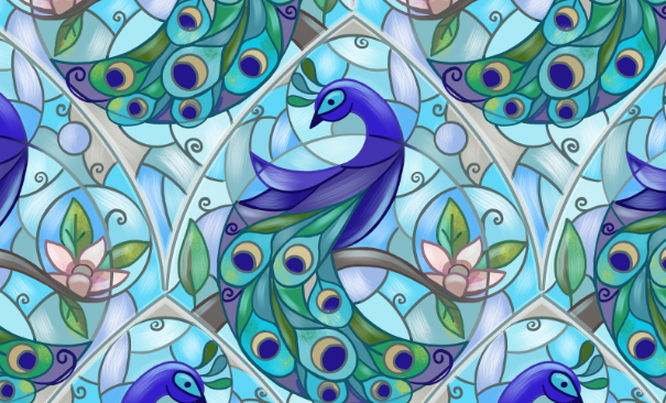
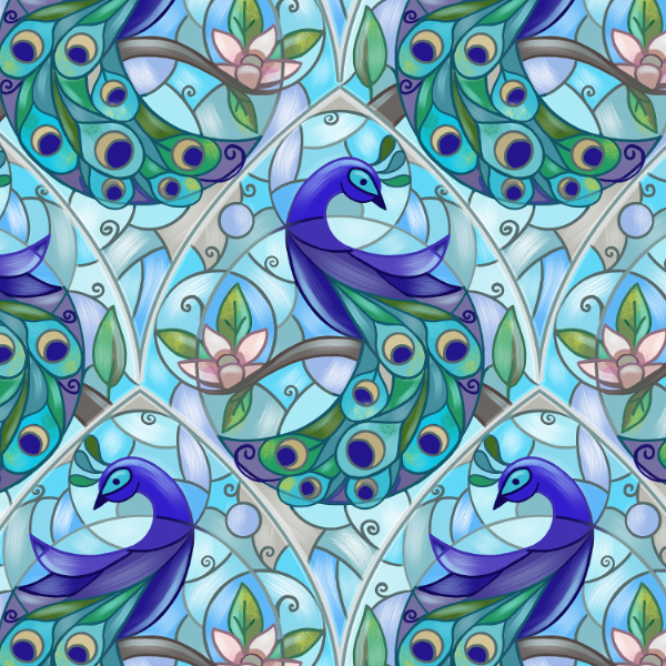
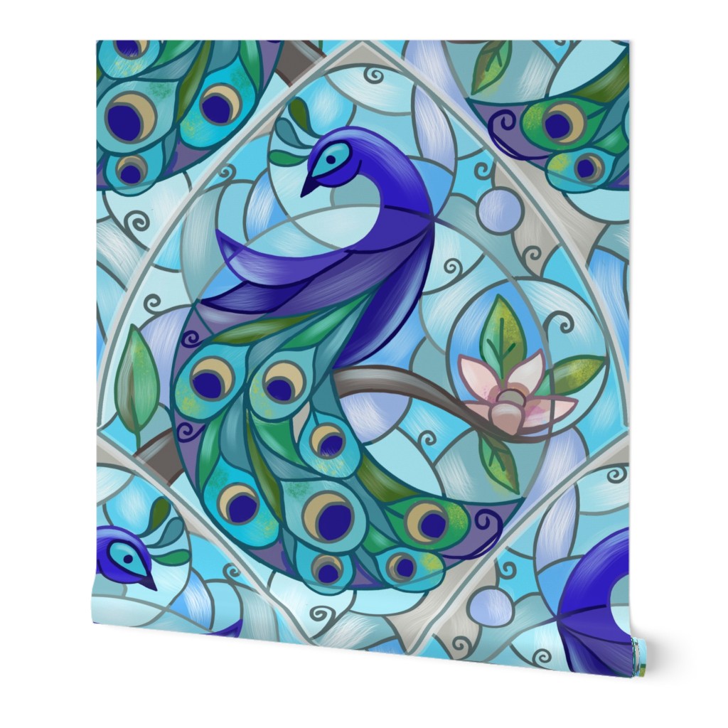
I ended up going with a stain glass art nouveau peacock and I actually had a lot of fun with circles in this design, can you see them?
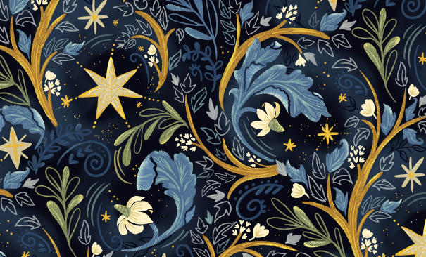
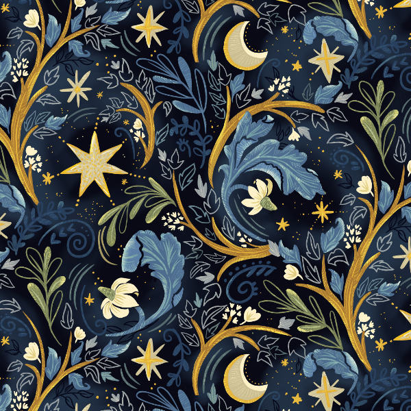
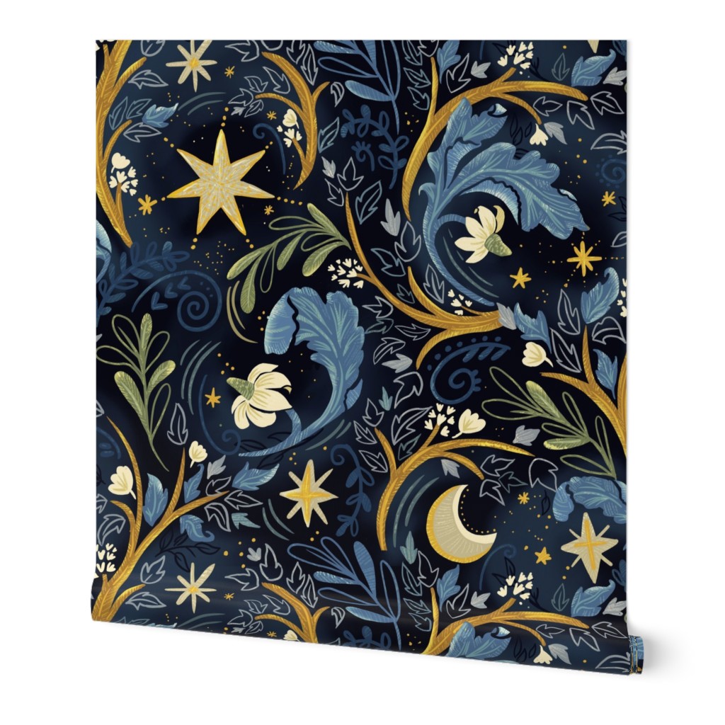
This was an interesting challenge to design for. I imagined myself lying in a garden meadow looking up to the stars! With all the light pollution we have in the Chicago area it never really gets very dark!
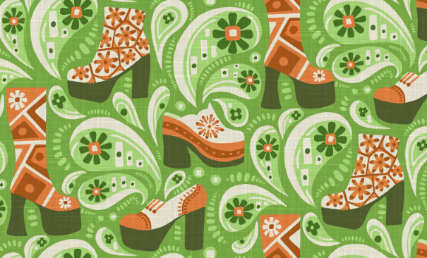
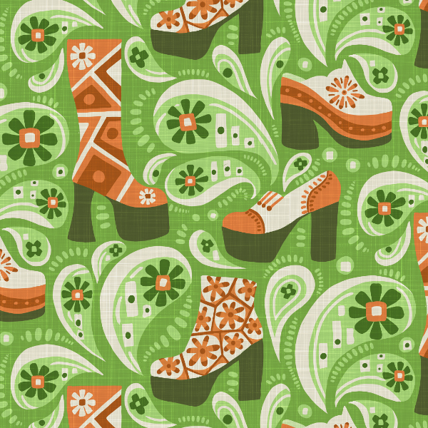
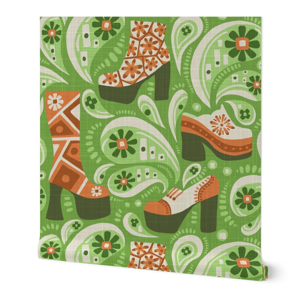
If 70′ decor is making a come back then I cringe, but it is the prompt for this week’s Spoonflower challenge.
I fiddled about with loud geometric shapes but nothing really spoke to me so I went in a completely different direction and ended up channeling platform boots … as you do! It would make a really interesting wallpaper for a vintage clothing store.
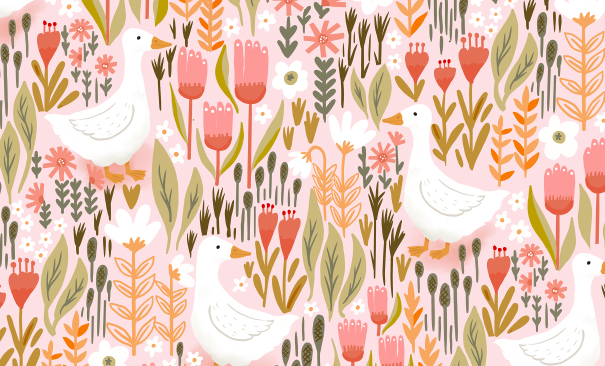
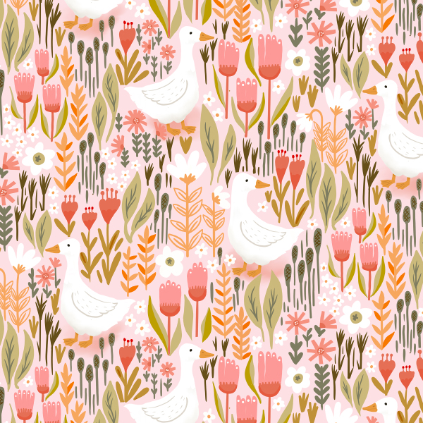
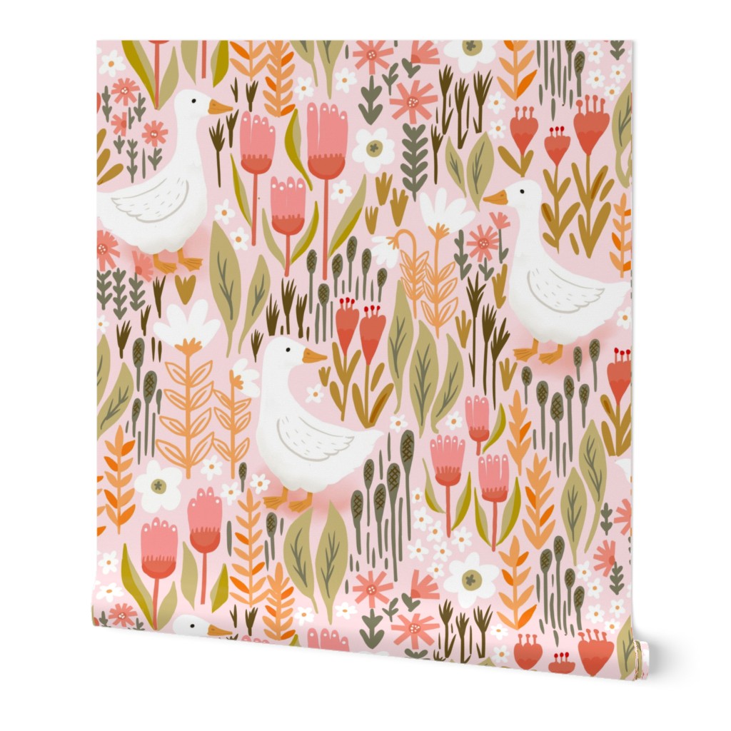
Cottagecore is the prompt for this week’s Spoonflower challenge and it was a fun one to design for. I went for a soft color palette and transported myself to a floral meadow with free range ducks.
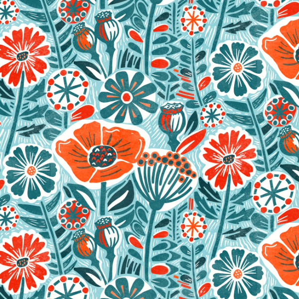
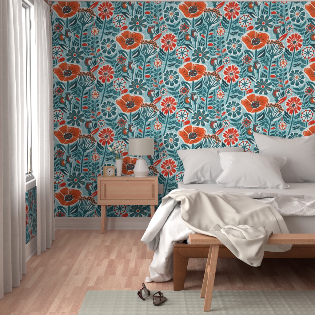
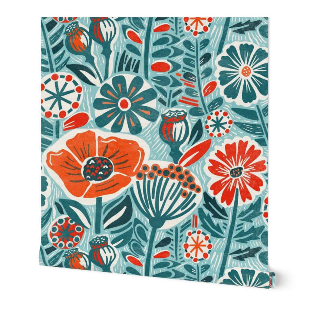
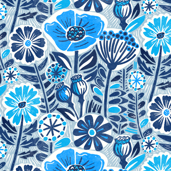
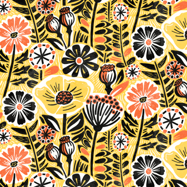
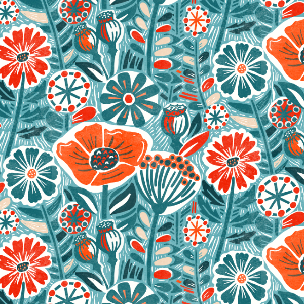
I absolutely adore the block print look and love designing in this style. But it is another floral challenge… and the challenge will be swamped like the last one.
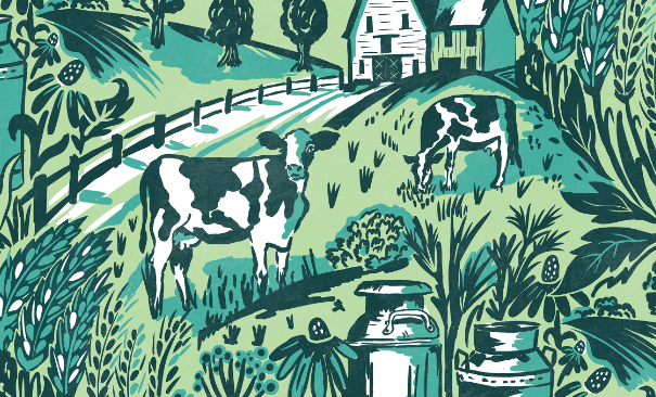
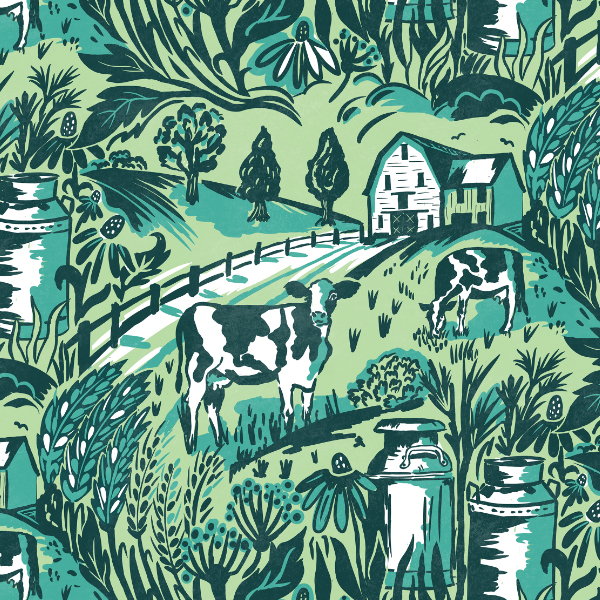
Ooh this sounds like an interesting Spoonflower challenge, Heritage Revival and it looks like we can take this prompt in any direction we see fit. It will make for an interesting voting because at least we won’t be swimming in a sea of same shapes aka Paisley or stripes or be limited to a a color palette you either love or hate.
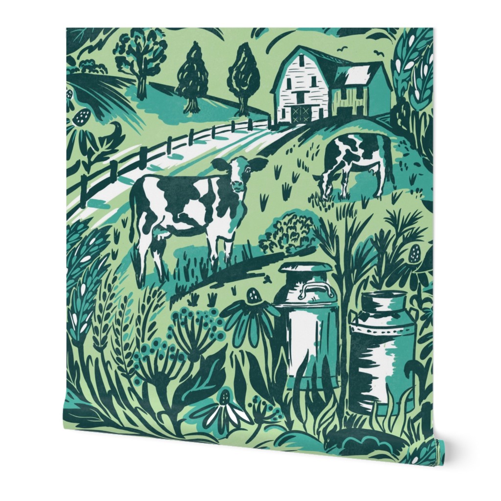
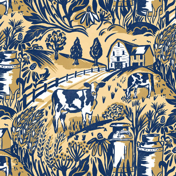
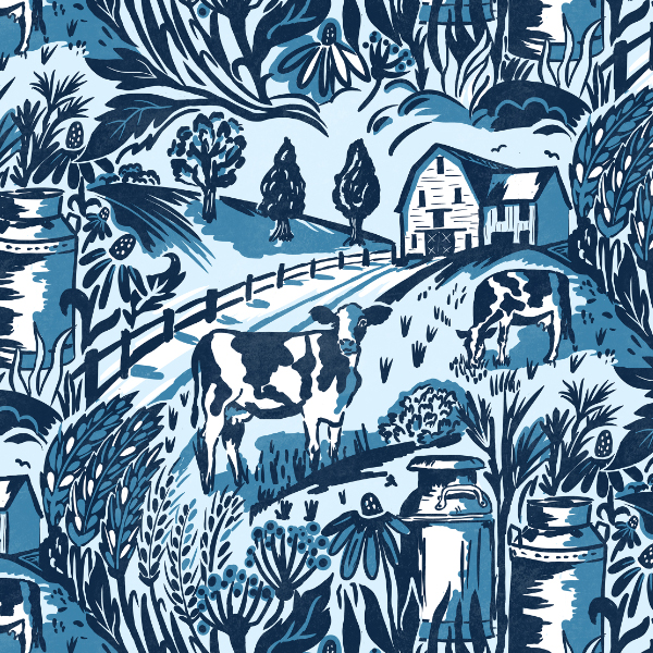
So when thinking about Heritage my mind goes straight to history and the traditions which come from the land. With that thought process I landed on dairy farms of a bygone age where milk came from pasture fed cows (no nut milks then! ) and was poured into churns which would sit at a farms gate waiting to be collected. Elevated milk churn stands can still be seen outside old farms in the UK.
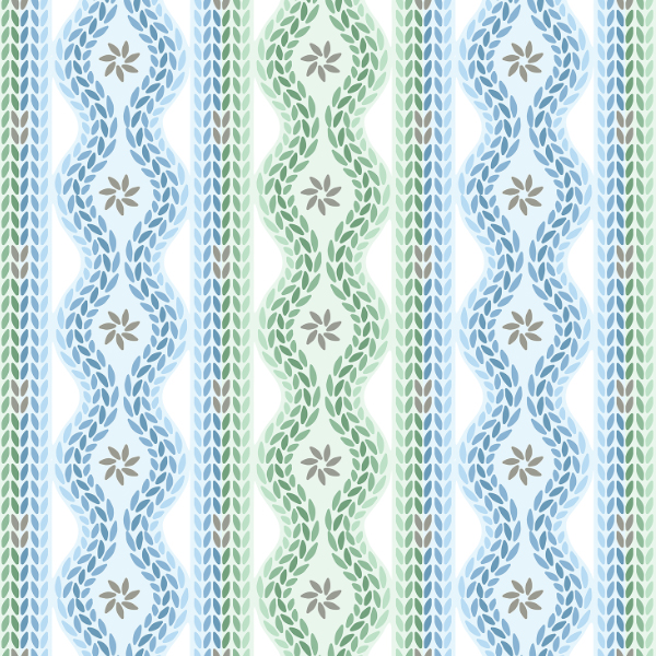
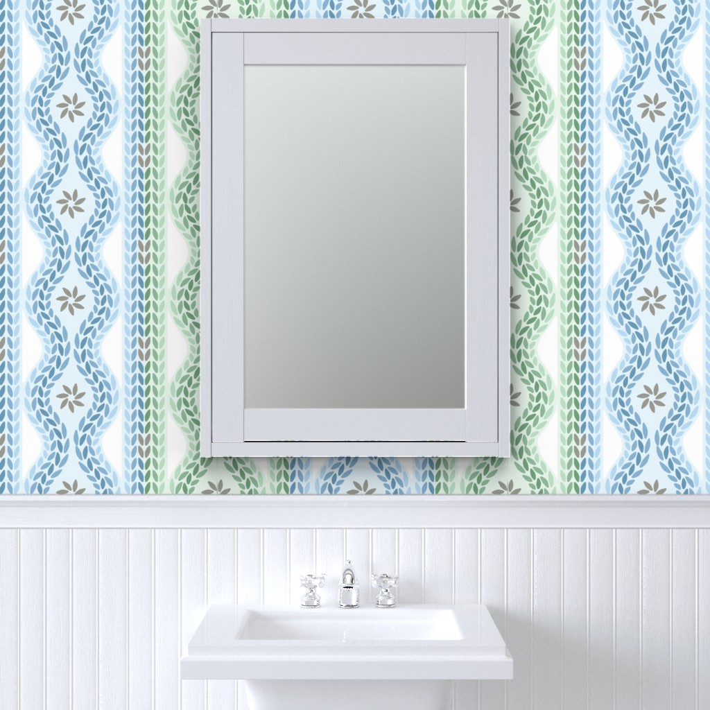
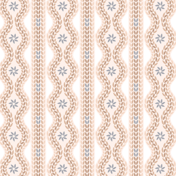
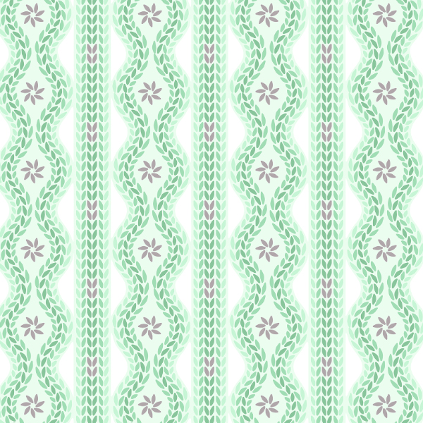
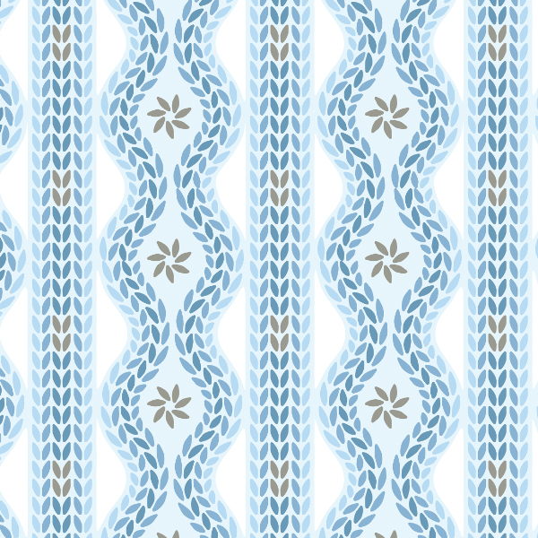
I adore a stripe and really don’t design enough of them so it has been fun playing around with them for this week’s Spoonflower challenge. In my book the challenge here is to create a design which will stand out in the challenge but actually be saleable!
I can imagine the challenge will be full of floral type stripe so I wanted to steer well away from that concept. I sometime think it would be nice if Spoonflower had a challenge where florals were banned!
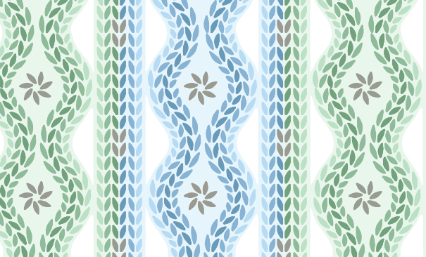
I got inspired by my winter sweaters and cable knit patterns and came up with this cable knit design